
For brands in the music industry — or even those outside it who want to connect with music lovers — the guitar pick is no longer just a small accessory. It’s a mini billboard, a tangible expression of your brand’s style and personality. The growing demand for customized guitar picks has opened up creative opportunities for companies to bring their brand colors, fonts, and design elements to life in a way that resonates with audiences. With Pick World offering high-quality printing and customization options, turning your visual identity into a stunning guitar pick has never been more achievable.
Table of Contents
Why You’re Guitar Pick Should Match Your Brand Identity
A guitar pick is a small but mighty tool for brand promotion. When designed with your unique colors and typography, it creates an instant connection between your music (or message) and your visual brand. Whether you’re handing them out at events, selling them as merch, or gifting them to fans, brand-consistent picks strengthen recognition and leave a lasting impression.
A cohesive look builds trust and makes your pick more than just a utility — it becomes a recognizable part of your brand experience.
Understanding Brand Colors in Pick Design
Colors aren’t just decorative; they communicate emotion and values. The first step in translating your brand colors onto a guitar pick understands their purpose:
- Warm colors like red, orange, and yellow evoke energy, passion, and excitement.
- Cool colors like blue and green convey calmness, trust, and professionalism.
- Neutral tones like black, white, and gray offer sophistication and versatility.
In pick design, these tones can influence how the player and audience perceive your brand. The right shades will make your pick pop on stage or in someone’s collection.
The Role of Color Accuracy in Printing
Matching your brand colors exactly is crucial for consistency. Professional printing technology can reproduce your brand’s Pantone or RGB shades with high precision. Using high-resolution printers and quality materials ensures your pick’s colors don’t fade or distort over time.
Keep in mind that the base material of the pick can slightly influence the appearance of colors. A white base will show colors more vividly, while a darker base can make them appear deeper and more muted.
Choosing Fonts That Reflect Your Brand Personality
Your font choice speaks volumes about your brand before anyone even reads the text. Serif fonts often suggest tradition and elegance, while sans-serif fonts feel modern and clean. Script or handwritten styles can add personality and a human touch.
On a guitar pick, space is limited, so fonts must be bold and legible even at small sizes. Avoid overly thin or complex typefaces, as they can lose clarity in printing. Instead, go for clean, strong designs that maintain readability while still reflecting your brand’s style.
Balancing Visual Elements for Impact
Since a guitar pick has a small surface area, every design decision matters. The challenge is to combine your colors, fonts, and possibly logos in a way that feels balanced rather than overcrowded.
One effective approach is to let one element — like your brand’s signature color — dominate the design, with supporting elements (like fonts and icons) playing a secondary role. This keeps the pick visually appealing without overwhelming the eye.
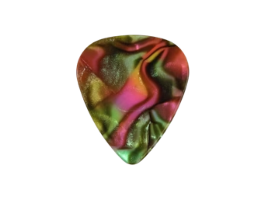
Considering the Pick’s Shape and Material
While the classic teardrop shape is popular, custom shapes can make your pick even more distinctive. Thicker picks may allow for bolder printing, while thinner picks can convey flexibility and playability.
The pick’s material — such as celluloid, nylon, or Delrin — affects not only the feel but also the way colors and fonts appear. Glossy finishes can make colors more vibrant, while matte finishes create a subtler, more refined look.
Designing for Both Function and Style
A beautiful pick is pointless if it’s uncomfortable or hard to use. Always ensure that your design complements the pick’s grip, thickness, and playability. For example, leaving space free from heavy printing on the gripping area can improve handling while still showcasing your brand colors elsewhere.
Functionality and aesthetics should work hand in hand — your pick should perform flawlessly while representing your brand visually.
The Psychology of a Well-Designed Brand Pick
When your brand colors and fonts are translated perfectly onto a guitar pick, you’re sending subtle but powerful messages. It shows attention to detail, pride in presentation, and a willingness to invest in quality. These traits can make fans and customers view your brand as more credible and desirable.
Musicians who use your branded picks on stage essentially become brand ambassadors, reinforcing your visual identity in live performances, videos, and photos.
Using Picks as Part of Your Marketing Strategy
Once you’ve created a visually perfect pick, the next step is integrating it into your brand strategy. Give them away at events, include them with product purchases, or sell them as part of exclusive merch bundles.
Picks are lightweight, portable, and affordable to produce in bulk — making them a highly effective promotional item. The more they’re seen and used, the more they reinforce your brand in the minds of your audience.
Conclusion
Creating a visually perfect guitar pick isn’t just about decoration — it’s about capturing the heart of your brand and putting it into the hands of musicians and fans. By thoughtfully applying your colors, fonts, and design elements, you can produce customized guitar picks that look stunning and feel authentic to your brand’s identity. With the expertise and quality offered by Pick World, your picks can become powerful tools for promotion, recognition, and connection in the music community.